Old logotypes
Posted: Thu Mar 03, 2011 9:30 am
Hello,
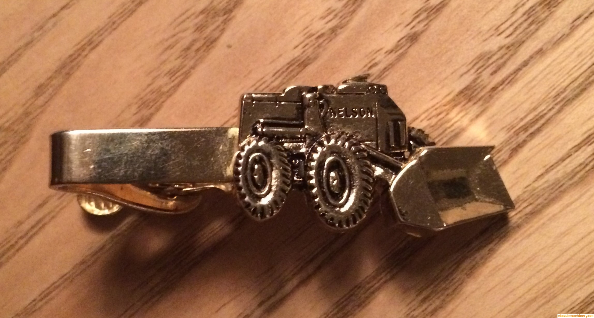
inspired by this topic about Nelson I thought we could start a topic about old makes and logotypes and the story behind them.
As you might know we started off the complete network around Maskinisten (that later gave the idea about CMN) around the Swedish make Åkerman.
The original logotype contained five Å arranged in a circle.
Later this was changed into six Å arranged in a circle.
The circle represented a drivewheel for the tracks.
On Åkerman H21 and older machines you can "see" the logotype there.
This is from a brochure for Åkerman 750BR: